


Winning submission for TypeFight 2025 by Malia Davis.
Top of the Type: Malia Davis Wins TypeFight 2025
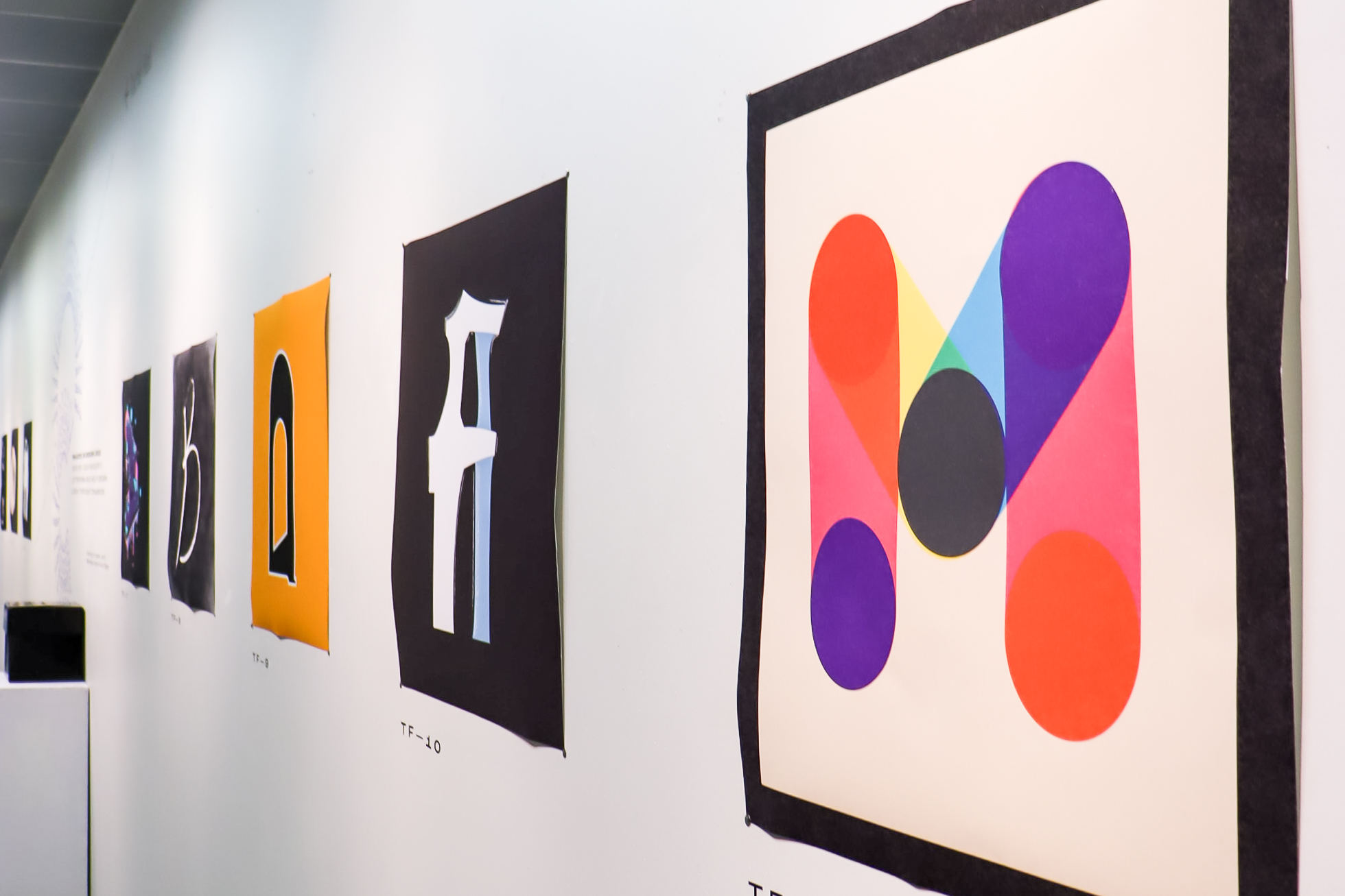
Congratulations to School of Art student Malia Davis, who took home the win in this year’s TypeFight competition – a friendly but fierce typographic design battle hosted annually by the Projects in Design course.

Malia Davis, winner of TypeFight 2025.
Malia’s winning letterform, a vibrant and layered take on the letter “M,” was inspired by risograph printing. Malia describes her approach as aiming for “a playful, vibrant mood – maybe a little bit of analog charm, but reimagined in a digital way.” She was especially drawn to the way overlapping colours in risograph prints create unexpected moments: “I wanted the letter to be layered and have meeting points, where the colours create new hues. There’s something very satisfying to me about bold shapes paired with transparency.”
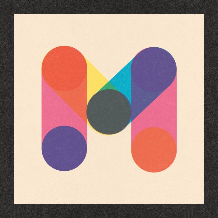
Final submission for TypeFight 2025 by Malia Davis.
The piece was built in Illustrator using simple geometric forms – primarily circles and lines – with Malia experimenting until the composition clicked. “I started by sketching very bold and bubbly letterforms,” she explains. “Then I got the idea to use this newfound inspiration from risograph art and try to imagine the letter ‘M’ that way.” From sketch to final design, it was an intuitive process: “I pretty much just kept adjusting the shapes and colours around until it felt right.”
Simplicity, unity, and rhythm were key. “I knew I wanted the ‘M’ to be bold and unified. The limited set of geometric forms helped with that, then the overlapping colours add that energy,” she says. “The texture is subtle, but it really helped to channel that analog look I was going for.”
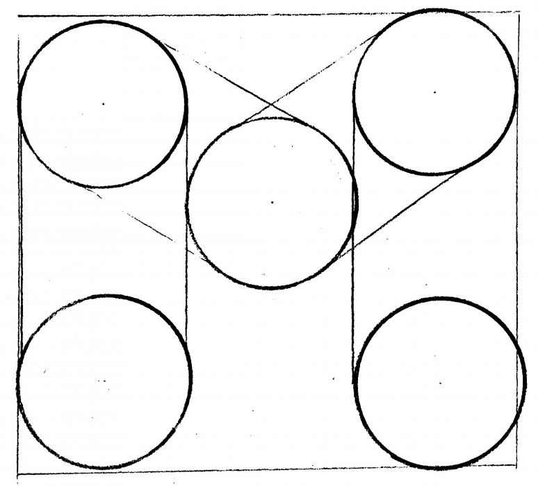
Initial sketch of the “M” concept.
TypeFight is held as part of the Projects in Design course in the Graphic Design stream. The competition gives students an opportunity to explore expressive letterform design in a collaborative setting. Associate Professor Daniel McCafferty, who first started TypeFight while teaching in Detroit, describes the project as “a way to encourage students to develop a creative daily practice that keeps them making things simply for the sake of making—with no other strings attached.”
Reflecting on this year’s entries, McCafferty noted: “Malia’s piece impressed because it was a sophisticated and playful use of form, colour, space and layering.” He also emphasized how TypeFight offers students the chance to push the boundaries of typography beyond function: “Typography today is an incredibly rich field for creative exploration—formally, conceptually, technologically, and politically. In a research university context, we can question these rules, their origins, what they represent, and how they continuously reproduce certain values while silencing others.”
For Malia, winning the competition was a meaningful surprise – but the community experience was the real highlight. “It was so fun being a part of the whole process, especially as a class,” she reflects. “When the winner was being announced, we did it as a class and it was really nice to just sit in a circle and reflect on each other’s work. I can tell that all my peers really respect one another, and we all admire each other’s design process and unique styles.”
Her takeaway from the project? Trust your instincts. “Just do what feels right for you,” she says. “Type can be expressive, fun, and totally abstract – and still make a strong impression.”
We’re proud to celebrate Malia’s well-earned win – and can’t wait to see what she designs next.