Thom Fougere won’t stop shifting in his chair.
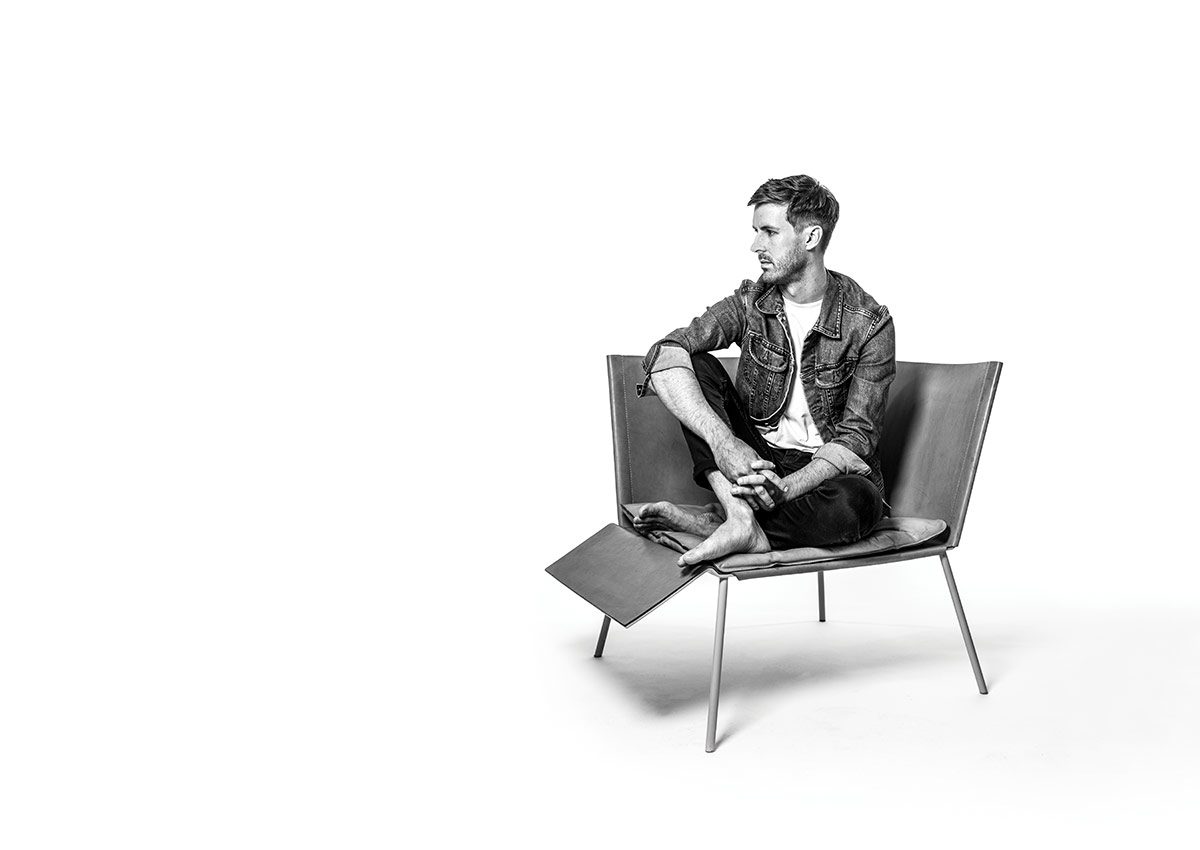
It has a back and only one side. What could have been a second conventional arm rest has been replaced by a platform for his legs.
“You can sit this way,” he explains, perched sideways, his legs up, in his Winnipeg condo. “You know how you have ottomans, to support your legs, rather than your feet? Which is pretty comfortable. You can just kind of, you know, find spots of comfort.”
Mid-demonstration, he faces forward and then sinks into the chair’s corner nook, like that of a sectional. It’s open for interpretation, explains Fougere, the creative director of modern furniture giant EQ3.
“I was attempting to invent a new type of chair, which is a lofty pursuit, and I had a series of cardboard models, like maybe six inches by six inches, and I think I filled two tables with different iterations of what that might look like. And they were all unsuccessful. I think this one could be a failure. I don’t know. This is just a prototype and I love it but it is a little strange. I’m happy with the result. But it’s strange….”
He trails off, leaning over the side and inspecting the vegetable-tanned leather within inches of his face as though he’s seeing it for the first time.
When you look at things, you look quite closely, I point out.
“Oh yeah? I guess I’m always looking…or do you mean, like, physically I look closely?”
Yeah.
He laughs.
“I didn’t know that. That’s a new thing I’ll have to deal with.”
He points to a smudge on the leather from the greasy fingers of his friend’s little boy, Monty. “His mom was horrified by the handprint but it’s, like, my favourite part.”
This chair that Thom built was revealed under his own design house, Thom Fougere Studio, at the prestigious Stockholm Furniture Fair in 2016—it created buzz but has not yet been picked up by a manufacturer. “This remains an idea. I think someday it will have a home but maybe it was too much too soon for the chair market,” Fougere jokes.
He lives in the future. For Fougere, it’s now spring 2020. At EQ3, he oversees the company’s identity in everything from photo shoots to store design to product line. This fall, the look is deconstructed plaid; floral comes next.
“Right now, I’m planning the marketing for 2019, planning what the actual look will be for 2020 but currently photographing 2018.
So they’re all in play at one time, which is tricky…. I get the years mixed up sometimes,” he says. “It’s gauging where things are going and what might be an interesting story to tell a few years in advance. It’s a little difficult but we’ve been successful.”
EQ3 is expanding rapidly, so much so that he can’t articulate the growth off the top of his head. “We have grown so quickly lately the numbers are a little out of hand,” he says. In a Globe and Mail article last year, Fougere was called one of the most influential figures in Canadian furniture, his impact bolstered by the reach of a company whose philosophy is to make modern furniture accessible.
Since 2001, the Winnipeg-based retailer (a branch of Palliser Furniture) has opened stores or partnered with dealers in 10 provinces, 24 states, and four countries overseas, including in Central America and the Middle East. While the retail industry might struggle to compete with online, EQ3 continues to plot expansions with two new locations opening in Chicago and another in New York. “We’re selling in all the major markets in Canada and now heavily pursuing the States and it’s a fairly large influential company in design, in Canadian design specifically, and to be part of that, it’s great,” Fougere says.
Confident yet self-deprecating, he had begun today’s interview with an apologetic: “hopefully it’s interesting.”
Fougere is barefoot in his living room within a three-storey building that’s perfectly 1959—a work of art that he believes is best left untouched. His space is open to the world with its wall of windows—a feature he loves.
The sun hits more than a dozen carefully curated plants in pots of varying scale. In the dining area, each of his five chairs is different from the next. Even his black single-speed bike by the door, with its tan handlebar tape, feels like it’s part of the design here.
In the adjoining kitchen is the sleek bar stool he created for EQ3—the one with only three legs. “I find all bar stools, counter stools, to be really ugly. So I thought, okay, let’s see if we can make a nicer-looking one. I don’t know if I was successful. I’m happy with it,” he says. “The idea was to make something that’s nice and easily shippable—this whole thing flat-packs in a really elegant way—and to reduce materials, thus reducing costs, hence the three legs, the shorter leg, but it’s still sturdy. It was kind of an interesting project to take on.”
Are you a perfectionist?
“Unfortunately that’s probably true. I probably dislike—I mean, I don’t want to exaggerate—but maybe 80 per cent of what I’ve designed. But nobody sees those things. It’s part of the design process. When you’re designing, let’s say a table, you go through many iterations and many designs before the one you end up presenting to the world. I’ve designed a lot of really ugly, bad, poorly thought-out things in the pursuit of something that will hopefully last and people will relate to.”

Photo by Thom Fougere
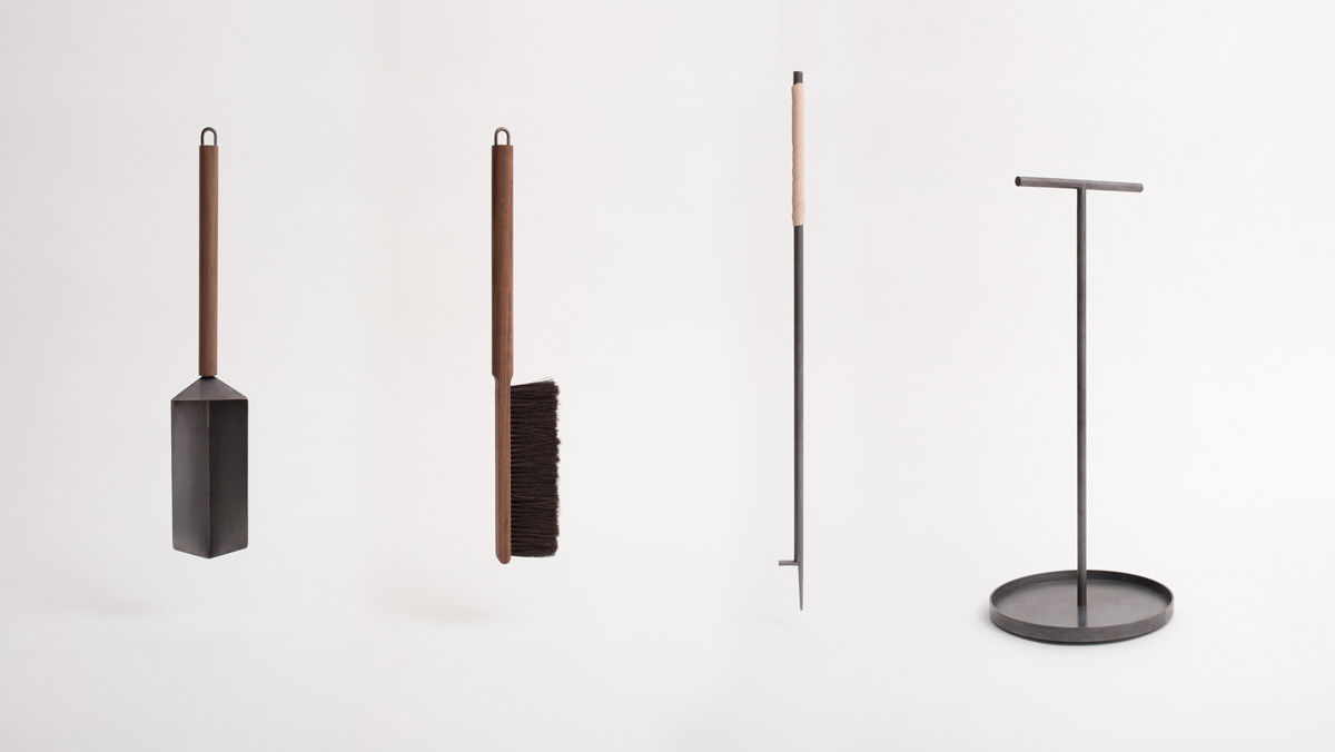
By the window sit the fire utensils he designed through his own studio—a modern take on century-old tools that found a place in actor Jason Bateman’s California home.
Oh, that’s neat—why do we think that’s neat?
“I don’t know. It’s like your weird connection to someone you vaguely know through your television screen.”
Do you wonder where your designs end up?
“Absolutely. Oh yeah, all the time. I’d love to see it all. I feel like I don’t see enough. But I also like the idea that they’re just, kind of, out there as well.”
Fougere grew up on the outer edge of Regina, Sask., on the last suburban street before the canola fields. His father is the city’s mayor; his mother he describes as “just one of the best moms in the world.” He didn’t inherit his dad’s love of politics but did his passion for drawing. As a kid, Fougere would sketch hockey players like goalie Felix Potvin (masks were easier than human faces and he wanted them to look as real as possible).
He remembers an abundance of paint swatches and the frequent rearranging of furniture as his mom routinely rethought their traditional home. “My mom still offers to come and paint my place,” he says, surrounded by all-white walls.
Fougere moved to Winnipeg so he could enrol in the University of Manitoba’s Faculty of Architecture. He was only 19 when he and three classmates—including Nils Vik [BEnvD/09], whom he still collaborates with—formed the design collective Keep It Cartesian. Their reimagining of faceplates for plug outlets and light switches, which doubled as cell phone cradles and key hooks, felt like a fresh update perfect for apartment life and scored them passage to popular design blogs and an invite to reveal their innovation at Canada’s top interior design show.
Fougere admits he felt the pressure taking the creative director post at EQ3 so soon after graduating with a degree in environmental design.
Vik, who is now EQ3’s senior director of brand development, says it’s Fougere’s rigorous work ethic, coupled with his clearly defined ideas, that made for such “a rapid maturation for the company.”
“He’s completely turned the brand around,” Vik says. “If you took a snapshot of the company eight years ago, compared to now, I think the degree of professionalism is completely elevated and we have a different aesthetic approach to how we present product and the product itself.”
Within a year, Fougere had jumped from junior designer to the top spot and immediately launched a major rebranding, transforming the design house’s entire look, from its store experience to its product line.

Photo by Thomas Fricke
Did you feel like people didn’t think you knew what you were doing because you were so young?
“There was so much of that, absolutely. That was definitely how I felt,” he says. “It was—I don’t want to use the word difficult, but it was. I mean, it was exactly what I wanted.”
He launched his own studio in 2015, giving him an outlet to create designs more radical and experimental in nature than what he produces for EQ3. On his own, he can also pay less attention to the economics of what will sell. Last year his studio received the DX Emerging Industrial Designer Award by Design Exchange, Canada’s design museum.
“I’ve designed a lot of really ugly, bad, poorly thought-out things in the pursuit of something that will hopefully last and people will relate to.”
Vik says Fougere’s style is feted for its signature muted vibe, always thoughtful, not showy. “He definitely avoids spectacle.”
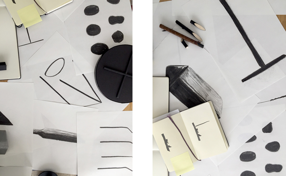
Long before his creations were ready to show in Milan and Stockholm, they took shape on old newsprint in charcoal drawings. At home, Fougere creates on his balcony, beginning with sketches so pared down you could mistake them for those of a child. “I try to get it as simple and archetypal as possible with the drawings. And then when we move into the details, I refer back to these to make sure the spirit isn’t lost. I always relate back to that original, to the purest form of the idea I guess, if that makes sense.”
The one he’s showing me apparently depicts a chair with a high arm.
When you look at this, do you see something more?
“This probably doesn’t mean anything to you, but it’s almost like a shorthand for myself.”

Photos by Thom Fougere
Another one shows a coffee table, he says.
“Maybe marble or wood. I mean it’s just a charcoal drawing, but it’s interesting to translate these things. You kind of see what comes out on the other side.”
Canadian design takes many shapes, which makes it tough to describe. Fougere says its diversity gives Canada a leg up on the international stage since it results in greater creativity—“it’s incredibly interesting.”
He credits the undefinable nature in part to geography. “We’re all on our own islands. Especially Winnipeg. Like, what’s around Winnipeg? But you know, what’s coming out of Vancouver is very different from what’s coming out from Montreal, from Toronto, from Winnipeg. And it’s all interesting but there’s no definable kind of thing you can latch onto.”
Whereas Nordic design feels homogenous—though it’s likely the strongest—as does the New York lighting scene, he notes, with surprising specificity.
Fougere’s influences include Japanese product designer Sori Yanagi, French architect Charlotte Perienne, and Irish architect and furniture designer Eileen Gray. (He’s soon off to Cape Martin, southern France, to walk through one of Gray’s buildings.) “Both female designers—they’ve been overlooked for many years until recently because it was a male-dominated profession but they really brought a human aspect to the modernist aesthetic, for lack of a better word, that I think was much more successful than modernism that we know today.”
Of the senses, which is most important in design?
“I think humans rely on vision the most, and a lot of designers, not to generalize, kind of push the other senses out of the way but I really think, yeah, touch and smell are incredibly important to how a person interacts with something or feels about it as well.”
Smell… with furniture?
“Yeah, it’s really subtle. Funny you bring that up because I read an entire book on this topic.”
There is stack after stack of books hidden behind his sofa (he’s still dreaming up a bookshelf design). “I think humans are natural collectors or infatuated with things. I know I really am.”
That would explain the groupings of small rocks sorted by Pantone Colour on his coffee table—he gathered them during a trip to the lake.
“I just found collecting them in clusters, with the hues, developed a nice colour range. I was just playing around.”

Photo by Mark Reimer
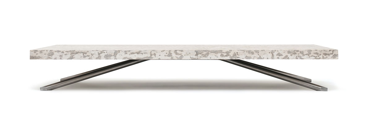
The coffee table itself, at 150 pounds with a tyndall stone top, sells for $2,200 and stands only 10 inches from the ground. Fougere explains its height is part looks—he likes the landscape of lower plains—and part practical: He likes to sit on the floor.
“I think my first well-known object I put into the world was this tyndall table,” he says. “And I don’t know if I can claim to be the first one, or one of the first, to bring tyndall stone into the home environment. Traditionally it’s used as architectural cladding.”
It made up the exterior of his elementary school and at recess, he would lay a piece of paper over top and with a pencil take rubbings of the fossils that lay within. “I didn’t really appreciate it until I travelled for EQ3 and then thought, oh man, it’s a super-exotic material and it doesn’t exist anywhere else in the world and it’s right in Manitoba. It never dawned on me to use it as a material, and now I’m just kind of consumed by it.”
Tasked with always being in the know, Fougere dislikes the word “trend.” His personal pursuit of timeless versus disposable aligns with that of EQ3, he says. “I’m constantly reading and pursuing and travelling and searching for whatever that is.”
He finds inspiration everywhere. Look closely at the best-selling EQ3 Tambour collection and you’ll see the old roll-top desk from Fougere’s grandma’s basement that intrigued him as a young boy. “I was playing with it again recently as an adult and I was like, nobody has kind of rethought this very typical, standard typology of furniture.
So I took that idea and, you know, tried to adapt it…. It’s like the rolltop, but on its side so it runs horizontally and it kind of opens up and is an entertainment storage unit or a sideboard. That has done pretty well. It seems to have some legs.”
During the making of his fire tools, which could be described as minimalist (it’s a word he doesn’t like since it’s over- and mis-used to suggest going without versus thoughtful selection), he looked to the Shakers, a religious sect similar to Quakers but known for shaking while they praised. He toured Shaker heritage villages in Connecticut and New York, intrigued by their centuries-old crafting of shovels and brushes.
“This is my favourite thing I think I’ve ever designed and it took the longest. It looks the simplest but I think it was a four-year process, which sounds ridiculous. The idea at the time, was to basically reinvent fire tools for the modern fireplace or hearth. Fire tools haven’t been really touched for maybe hundreds of years and haven’t really been updated for the modern home, and so I had this idea about, you know creating something as a solution that was beautiful and functional and maybe rethought what fire tools were.”
The poker is inspired by a tree branch. The shovel, the greatest departure from convention, allows for getting into small quarters and the ashes to slip down its spine for easy disposal.
“I really love art but I’ve really enjoyed just the emptiness at the same time.”
“The unfortunate thing about the Shakers is they were celibate so they no longer exist,” he says, before adding, “I have lots of books about them behind the couch.”
His condo is still under renovation (it’s going on several years now) so he hasn’t hung anything much on his walls, but there is an original Shaker shovel, a gift from a friend. “I really love art but I’ve really enjoyed just the emptiness at the same time,” says Fougere, who a few times this evening has apologized for getting lost in his head.
He is always observing. Pondering. Imagining a new take.
Fougere appreciates curious detail, like in the old metal Japanese mirror he picked up in San Francisco, so aged it reveals only a darkened, blurred reflection.
How would you describe yourself?
“I don’t know. I wish I knew myself better.”
Exactly one decade ago, the U of M’s alumni magazine asked the creative thinker where he saw himself in 10 years, and he quipped, “I wish I could see that far ahead.”
“Oh, a cop-out answer, that sounds like me,” he says with a smile.
Is this where you want to be?
“Uh, I feel like it is. Yeah, I think 10-year-younger me would be alright with 31-year-old me.”


Hi Thom!
I love this informative article about your successful and unique creativity and your incredible down to earth attitude. Congratulations on all your accomplishments to date!
Would we be able to order the fire tools?
Wanda S